Fleming’s Private Dining Booking Experience
Role: Senior UX Architect
Simplifying the way customers book their business event or private dining experience was top of mind for Fleming’s Prime Steakhouse & Wine Bar. Transforming their lengthy, multi-step form into an optimized, informative but visual design was my main responsibility for this project.
Summary
Background
In addition to being an upscale restaurant, Fleming’s Prime Steakhouse & Wine Bar was also a desired location for booking business or private dining events. They were in the process redesigning their whole website and also incorporating ecommerce, but they also needed to address improvements to their private dining booking experience.
My Role
After having successfully implemented the UX process and improving the customer journey of Outback Steakhouse’s ecommerce website and also strategizing how to incorporate ecommerce to Bonefish Grill, I had an opportunity to enhance Fleming’s Prime Steakhouse & Wine Bar’s online private dining booking experience.
Problem
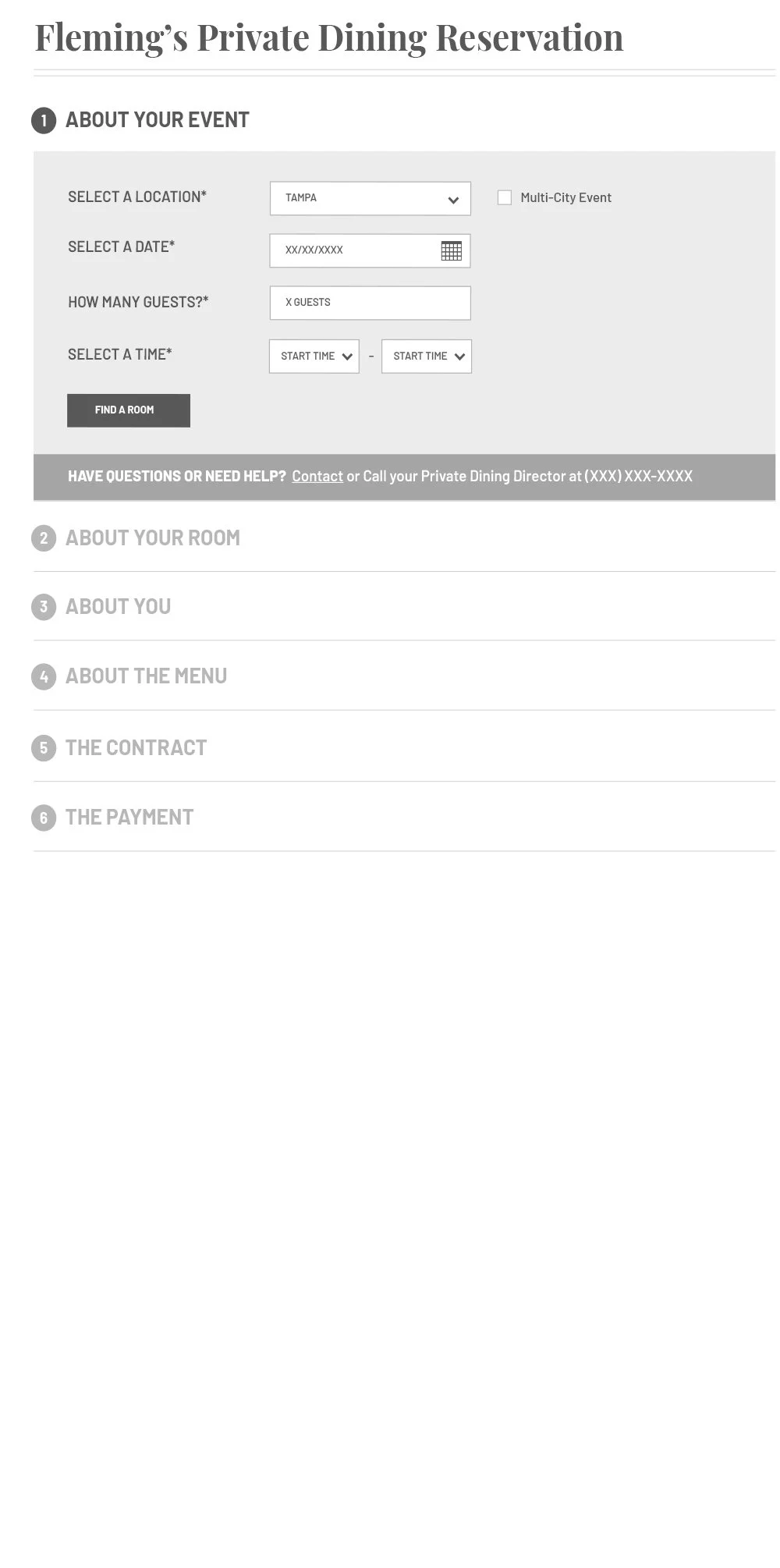
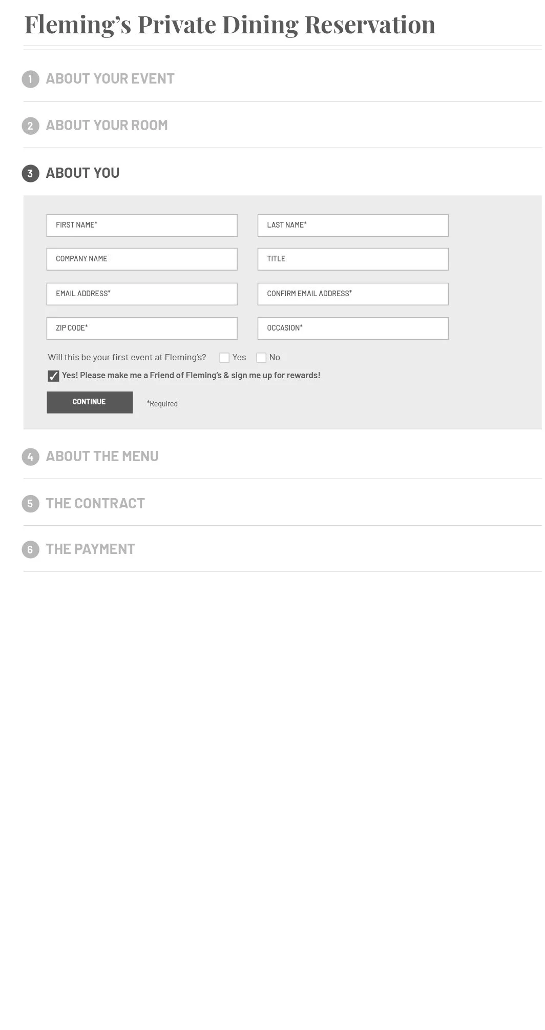
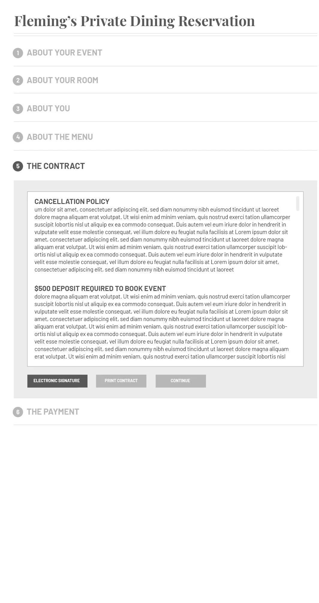
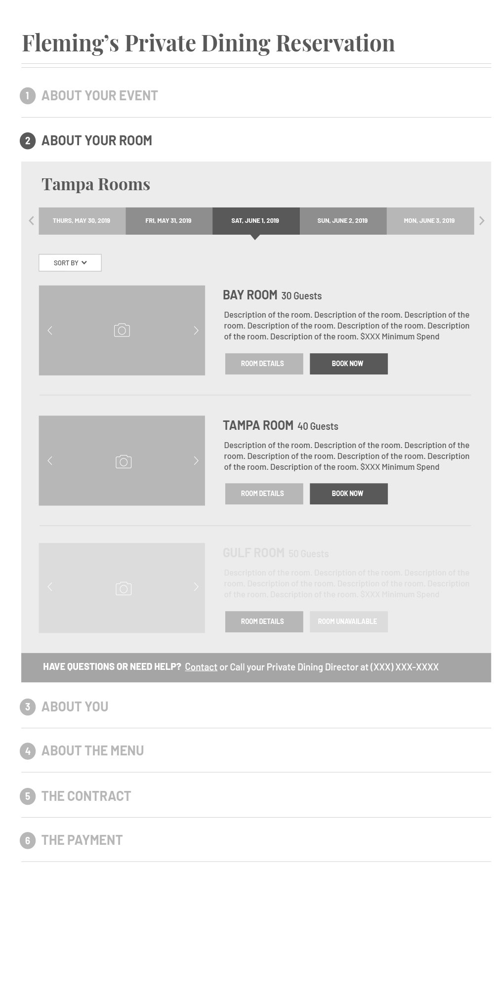
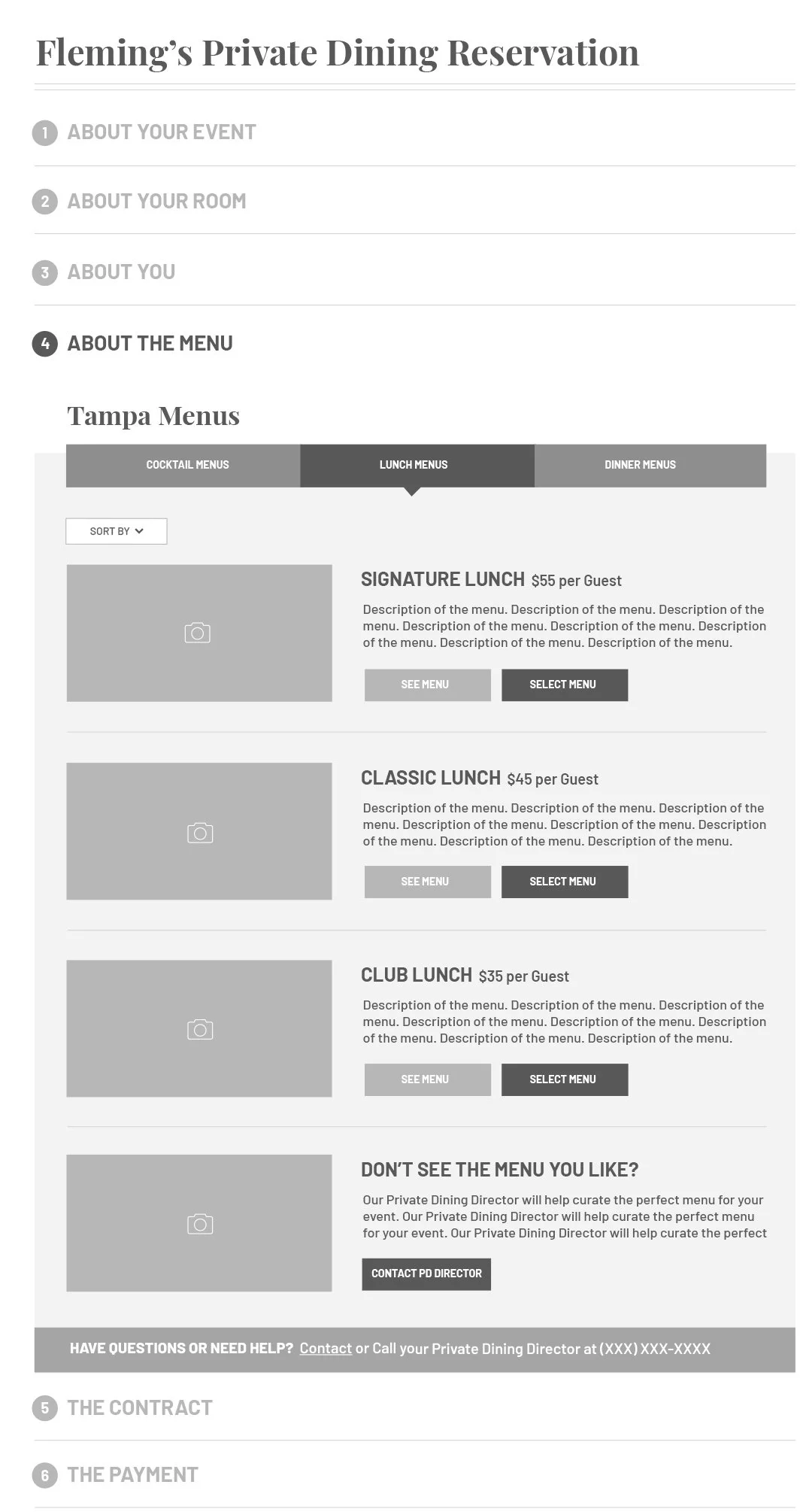
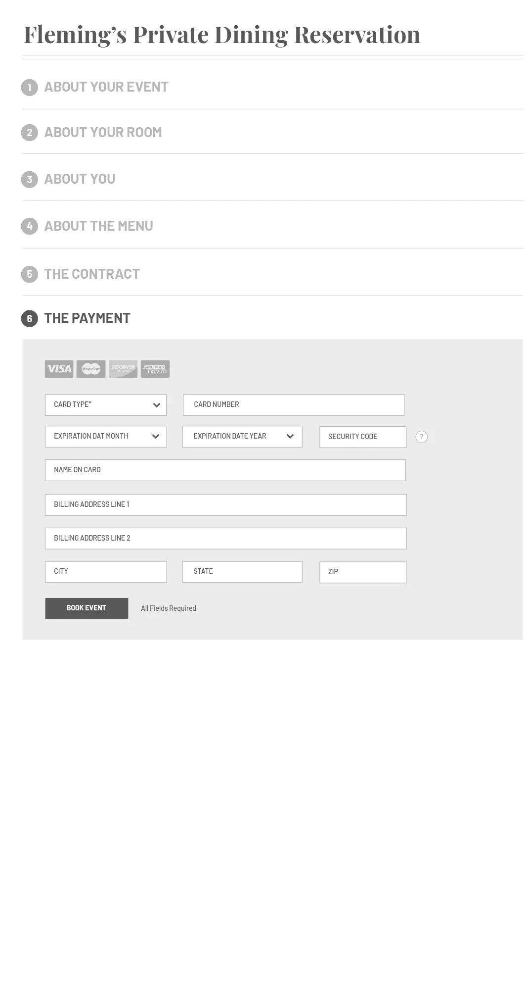
Fleming’s had an existing form design created by their digital marketing agency to capture details for business or private dining bookings. It was a lengthy six-step process which lacked additional details customers needed in order to make an informed decision before booking. The page required simplification and emphasis on availability, alternative options, guest count and transparency on minimum spend.
Previous six-step online form wireframe for private dining booking.
Define
Requirements
In addition to date availability, location, and guest count, other items that needed to be included were:
Time frame
Distance
Minimum spend and required deposit
Alternative availability options: other time frames and/or other rooms nearby
Meeting room features selection
Additional event needs selection
Optional floor plan selection
Reduce emphasis on event menu options since this was being done more thoroughly over a conversation with the customer after initial booking.
Booking location details.
Research
Competitive Analysis
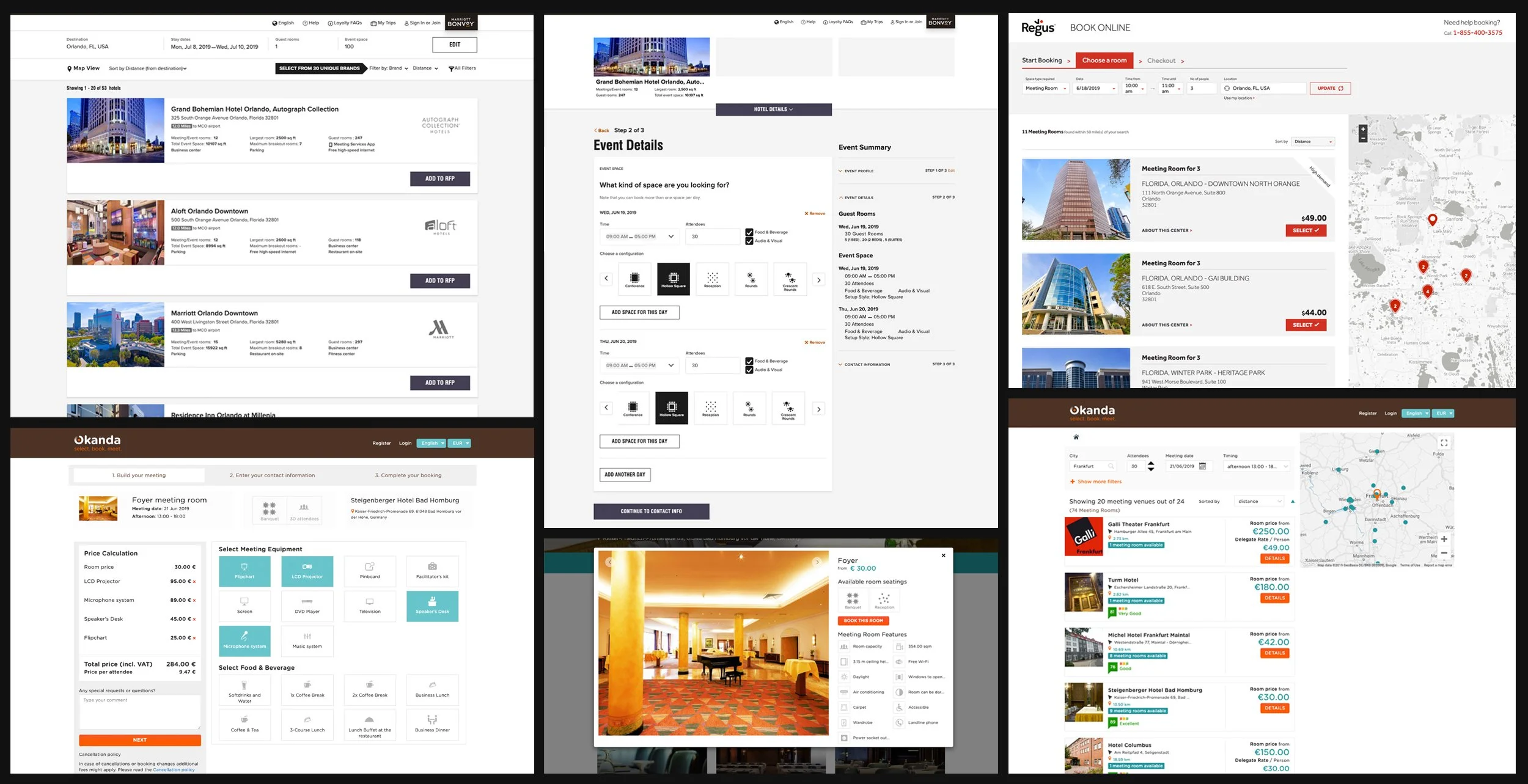
Before even thinking about the design, I started out doing research on other sites that offered event and meeting room bookings in order to uncover:
What are the best practices being used?
How were details being displayed and organized?
How they sorted the results?
Other sites that offered event or meeting room bookings.
The Vision
Wireframe
Bases on the requirements and the competitive analysis, I came up with the following wireframe which included:
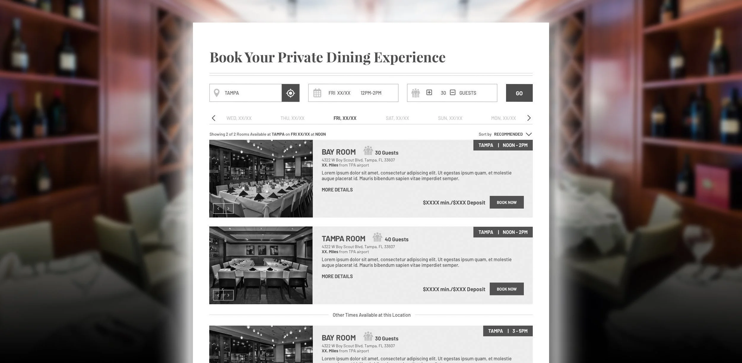
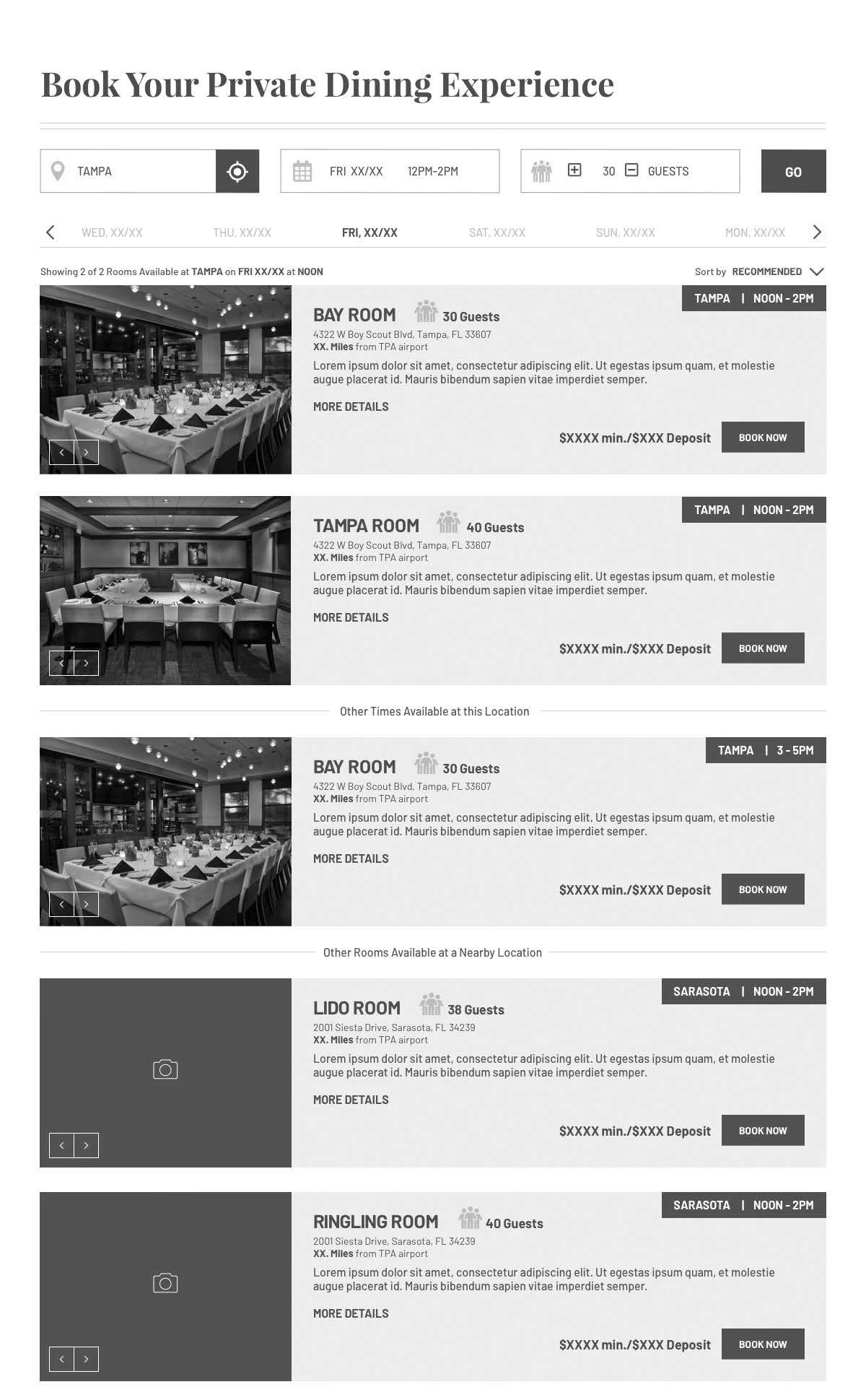
Beginning the booking experience by first searching for desired location, date and time, guest count, and displaying available rooms before inputting details about the event.
Consolidation of location date, time and number of guest to one row.
Kept the horizontal scroll to navigate between dates
Also kept the general layout of the results but added quite a few more details into the same space.
Address of restaurant and distance from nearest airport
Minimum spend and deposit required.
Exact time of availability
One clear call-to-action to Book Now and a secondary text link to More Details.
Within results, additional result details and alternate suggestions at the location or a nearby location.
Clearer sorting options that included recommended, minimum spend, distance, guest count
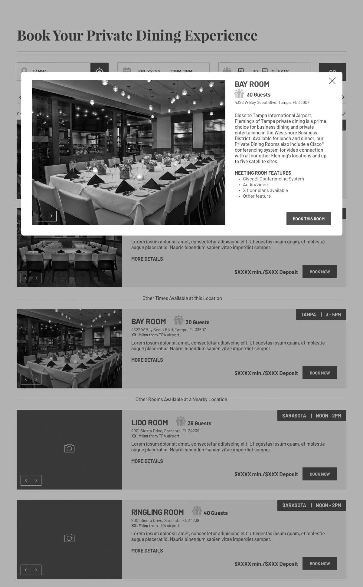
Added meeting room features to the More Details modal as well as a call to action to Book from the modal.
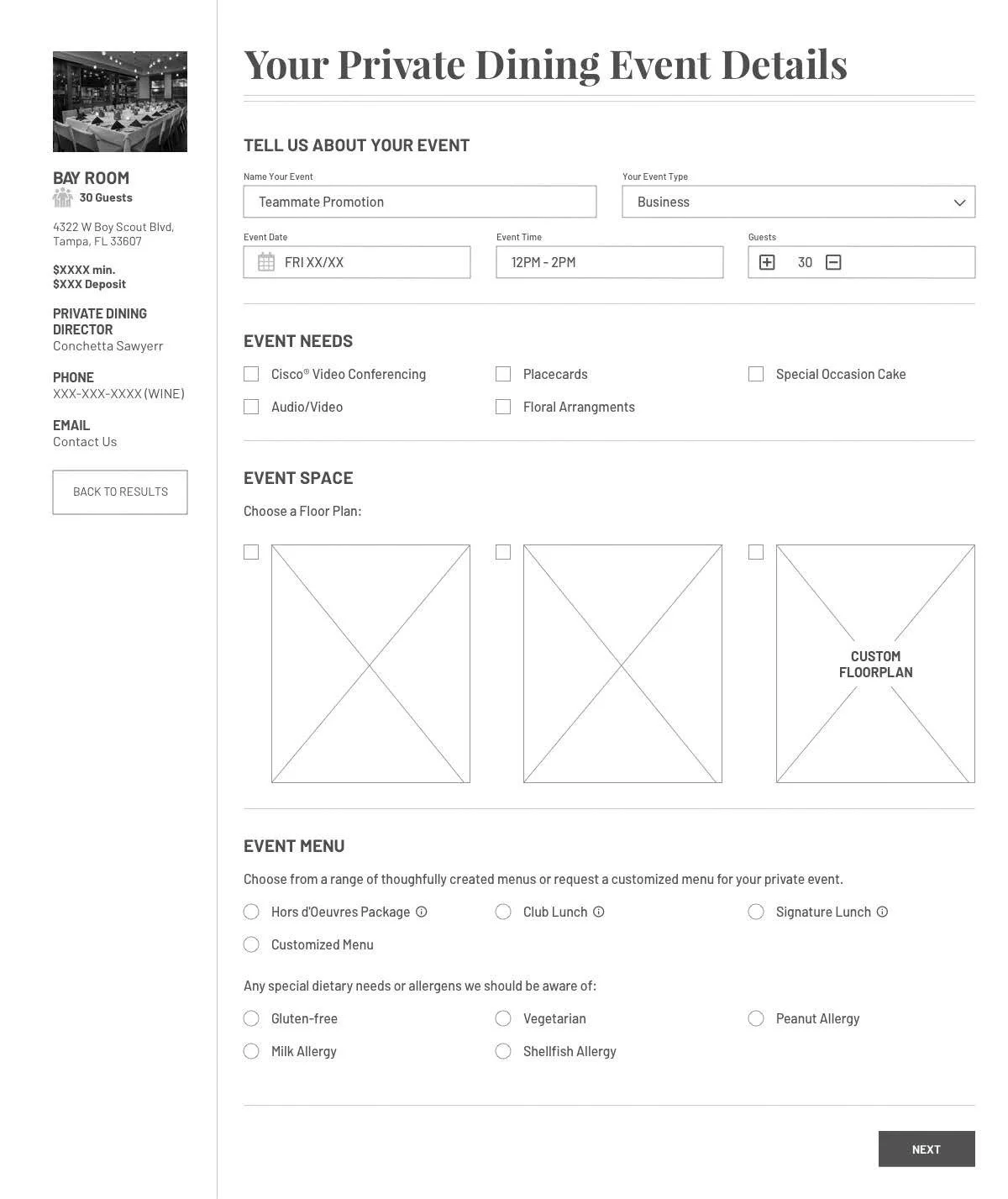
Improved the logical flow of inputting event details after selecting Book Now by:
First requesting the name of the event and the event type.
Pre-populating event date, time and guest count.
Displaying chosen room and additional details about the room and location on the left side of the page in case customers wanted to reach out to someone before formally booking.
Providing options for event needs and event space floor plans.
Providing general menu options and specifying dietary needs.
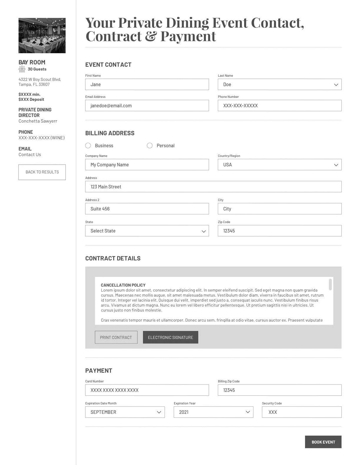
Requesting event contact details and billing address.
Consolidating the view of contract details.
Finally asking for payment info before booking.
Outcomes
The wireframes received praise from the President and the Head of Marketing of Fleming’s and were provided to their development team to implement in a future iteration. Some of the impact of the redesign were:
50% reduction of steps
Incorporation of search as an initial step before booking
Over 200% increase in details provided in the search results view
Integrated a natural, logical flow for inputting event details.
80% increase in event detail options without increasing number of steps.

